Brief
This project focused on building a user-friendly platform that enables both researchers and the general public to access, interpret, and act on COVID-19 data. The tool aimed to provide real-time insights through simplified data visualizations and predictive modeling to support public health decision-making and awareness.
Project
Client / Carnegie Mellon University
Type / Information and UX Design
Industry / Health, Technology
Date / 2021
Team
Project Lead / Yvonne Mburu
Research Professors / Patrick McSharry, Moise Busogi
Information & UX Designer / Ernest Kufuor(Me)
Research Assistants / Isaac Coffie, Nathalie Uwamahoro
Overview
I believe the period from 2019 to 2022 will be remembered as a dark age for anyone actively present during that phase. From restrictions and lockdowns to isolation, falling sick, and even losing loved ones, COVID-19 had us in a state of panic. Like any global threat, the realms of science and policy united to seek solutions. I digress from the main purpose of this portfolio, but in another life, I might be a writer.
I had the privilege of collaborating with brilliant minds like Patrick McSharry, Yvonne Mburu, Moise Busogi, and an exceptional team on modeling COVID-19 for Africa. Our objective was to navigate through policy and machine learning models to generate reporting and predictive tools. In case I didn’t mention(which I didn’t), I’m also a data scientist however I won’t delve into the technical intricacies of the project; let’s dive into the reason you’re here for – the design.
Design Considerations
The foremost aspect to highlight is that we were operating at an intense pace! This group comprised highly intelligent individuals facing new requests based on fresh methods or findings every week. The only viable approach for this dynamic environment was rapid prototyping – speculate, prototype, feedback, iterate.
To enhance accessibility, we opted for a web app accessible to anyone with internet access.
Our target users ranged from highly technical individuals to the average person, demanding a delicate balance between depth and simplicity to cater to both ends of the spectrum.
Iterations
Haha, so… I lost some of my design files and can’t show the full picture. My bad. But thankfully, I managed to salvage a few!

This project was constantly evolving—every new request from the research team introduced fresh variables. I approached the design process as a living system: rather than aiming for perfection in the first pass, I focused on rapid iteration. Each prototype served as a stepping stone, helping the team visualize possibilities and give more targeted feedback.
Early iterations prioritized structural clarity—what goes where, and how to surface the most relevant data for our diverse users. I balanced functionality with legibility, and made sure that, even in low-fidelity form, the design communicated its intent clearly.
Note: The final video of the design is at the end of this amazing catalogue. So don’t skip!
Initial Iterations
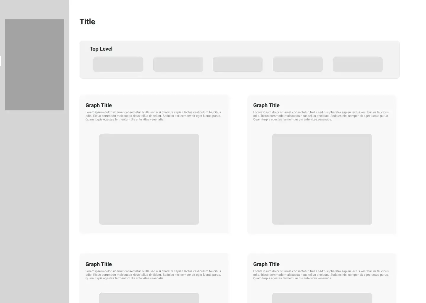
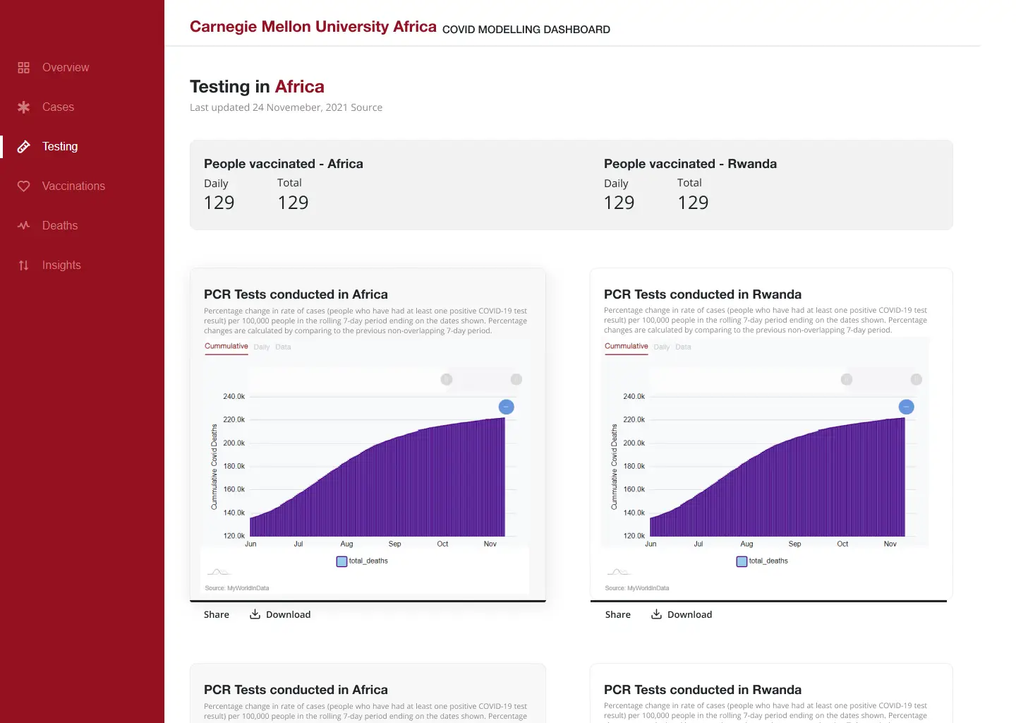
In these initial designs, my main goal was to establish a strong structural blueprint. I focused on how best to organize and present information in a way that would scale. This meant prioritizing layout, flow, and component reusability.
I kept the interface simple to make room for the complexity of the content. The aim was to create a sense of calm around information that could otherwise feel overwhelming. With such a wide audience, clarity mattered more than flair. The idea was also to prototype and get feedback as quickly as possible.
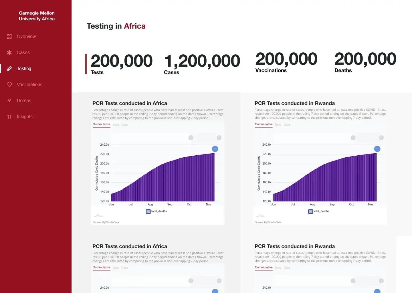
Midway Refinements
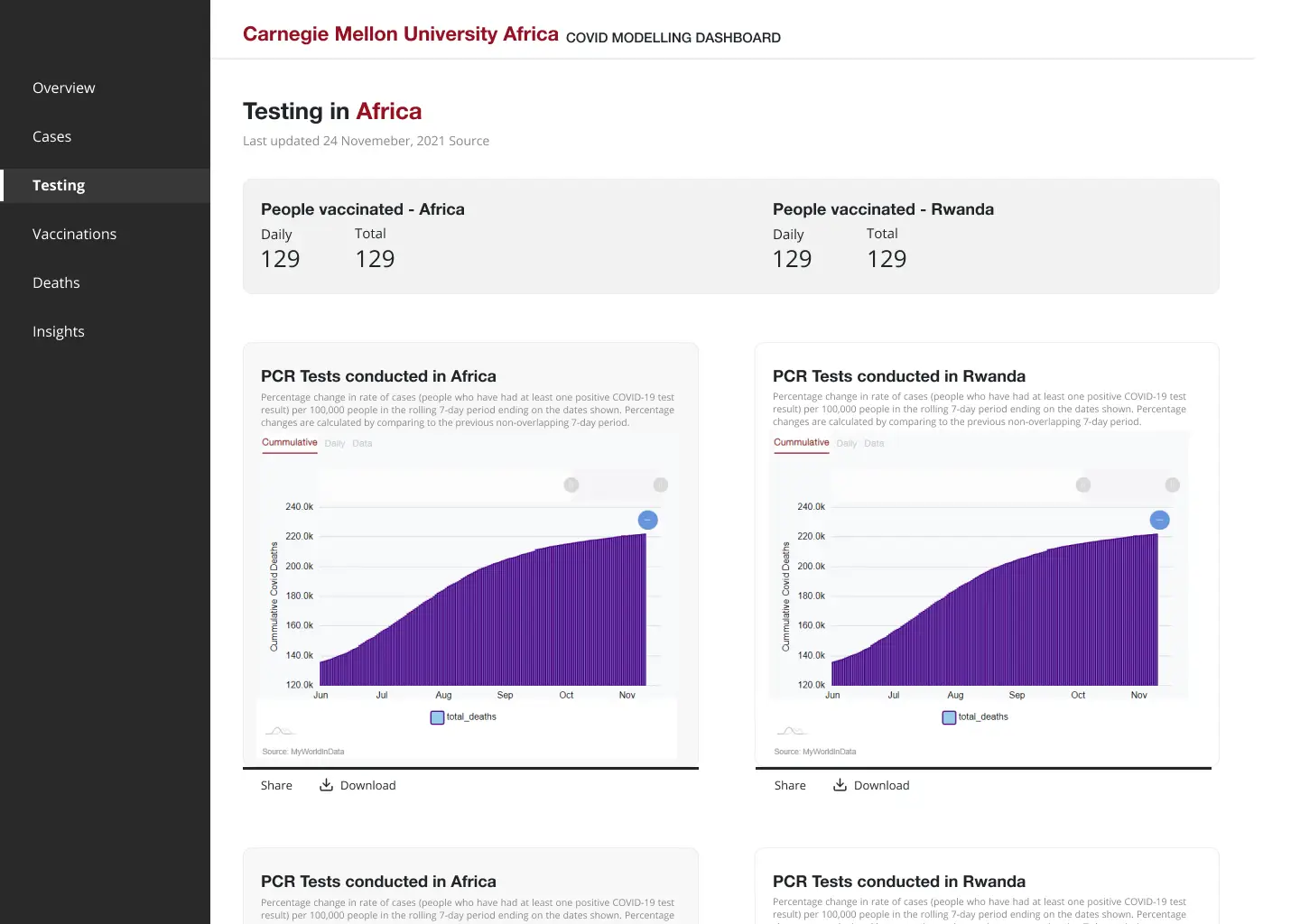
As the project progressed, the design needed to accommodate more detailed requests and additional layers of data. I worked on improving the visual hierarchy and adjusted layout spacing, typography, and interactive elements to enhance usability.
Around this stage, collaboration across teams became more fluid. I incorporated ongoing feedback from data scientists, developers, and stakeholders to ensure that every element of the interface aligned with both the model outputs and user expectations
I also refined components to balance function with visual consistency. Color choices were revisited for accessibility, and I paid special attention to how users would move through the experience based on the type of insight they were looking for.
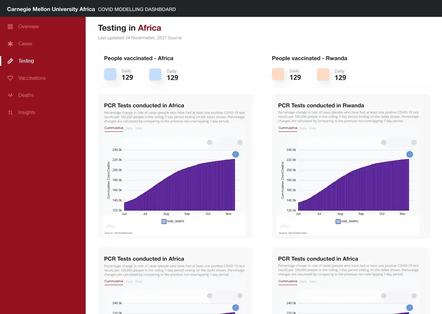
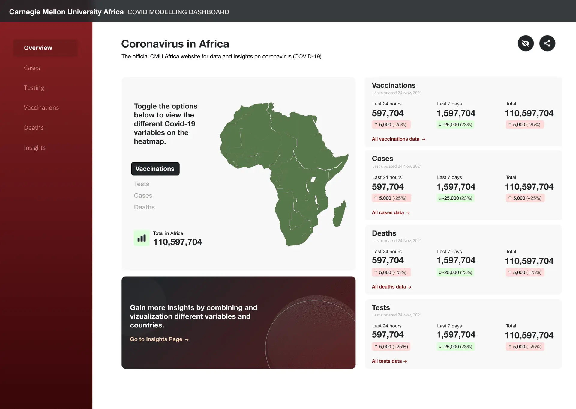
Final Iterations
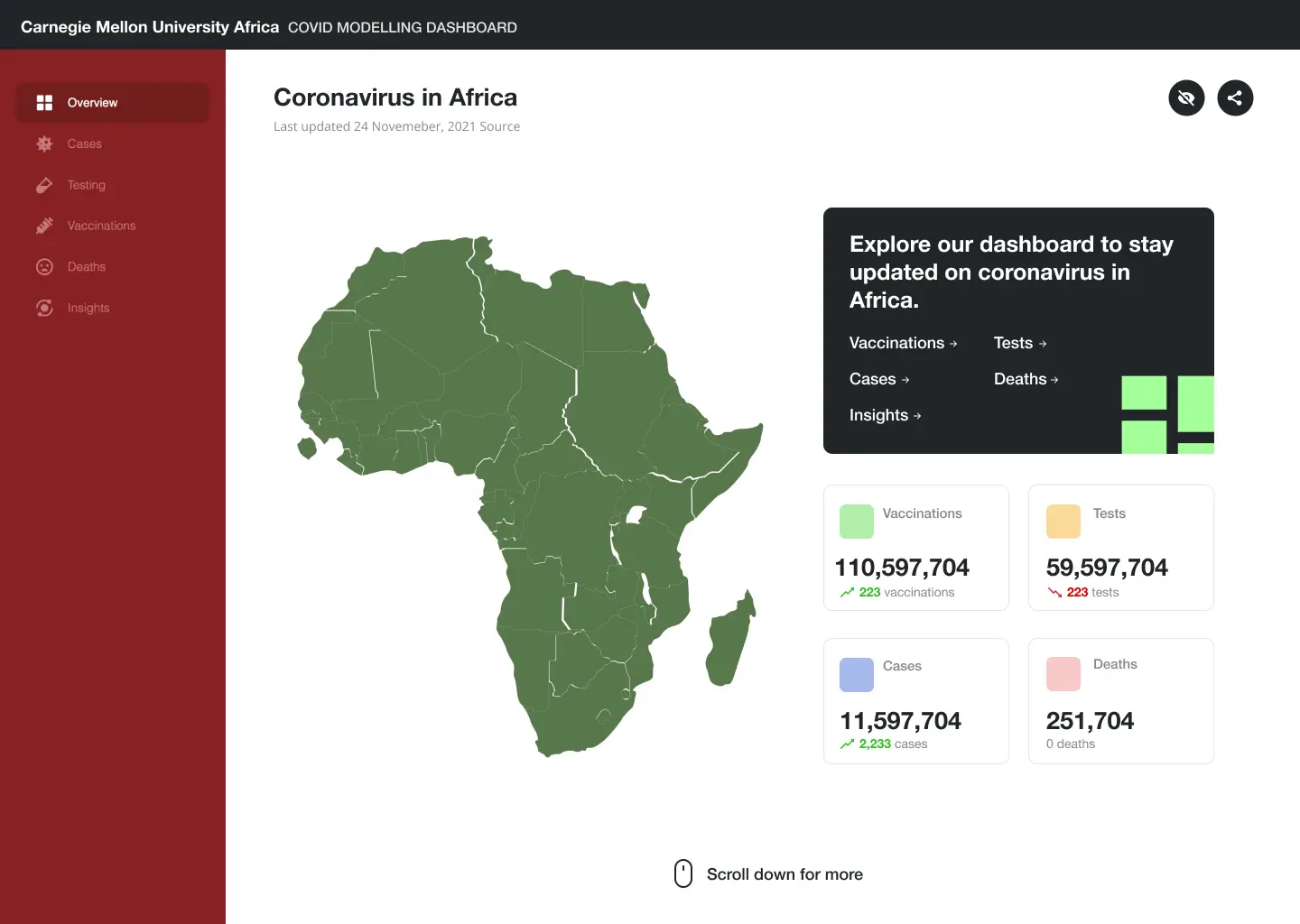
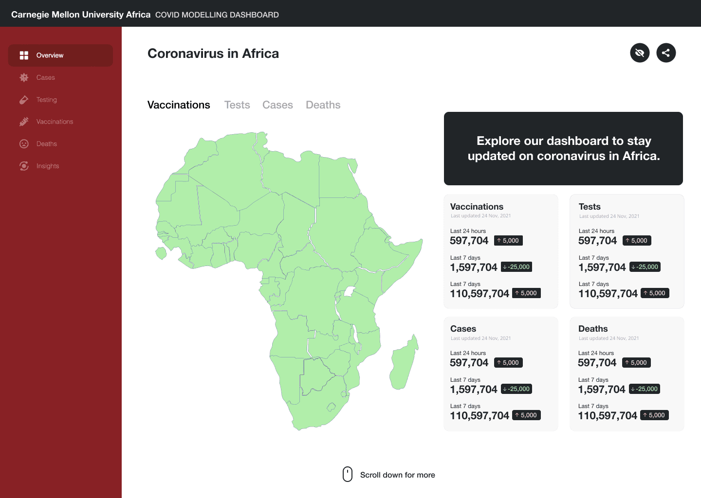
In the final phase of the design process, the team had a much clearer understanding of what was needed and what features were most valuable. This clarity allowed me to focus on elevating the overall experience.
I honed in on interaction patterns, ensuring intuitive flows and clean visual transitions. More attention was given to the geographic visualizations since location context was critical. I also optimized key dashboards to support quick scanning of trends and insights.
This last stretch was all about finishing strong. I refined the design system, ensured consistency across views, and added small interaction cues that would help users navigate with ease. By this point, the work had matured into something that balanced function, form, and clarity.
And there you have it – we’ve reached the finish line! Check out the video below to see the final app in action. It was undoubtedly a challenging yet incredibly rewarding project, and the learning curve was massive. Huge thanks to the amazing team, and, of course, a shoutout to Mum and Dad – they always deserve a special mention.